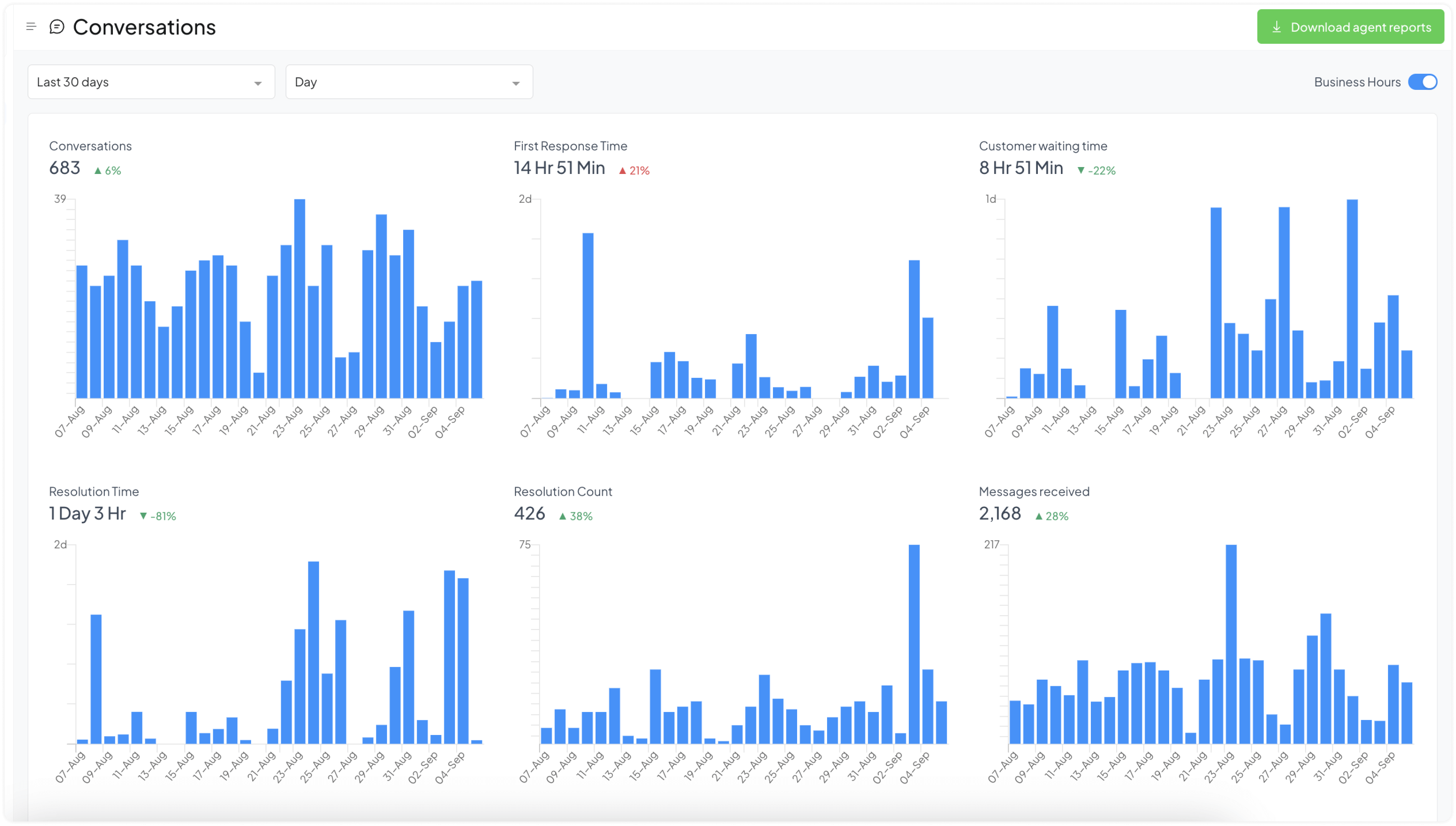
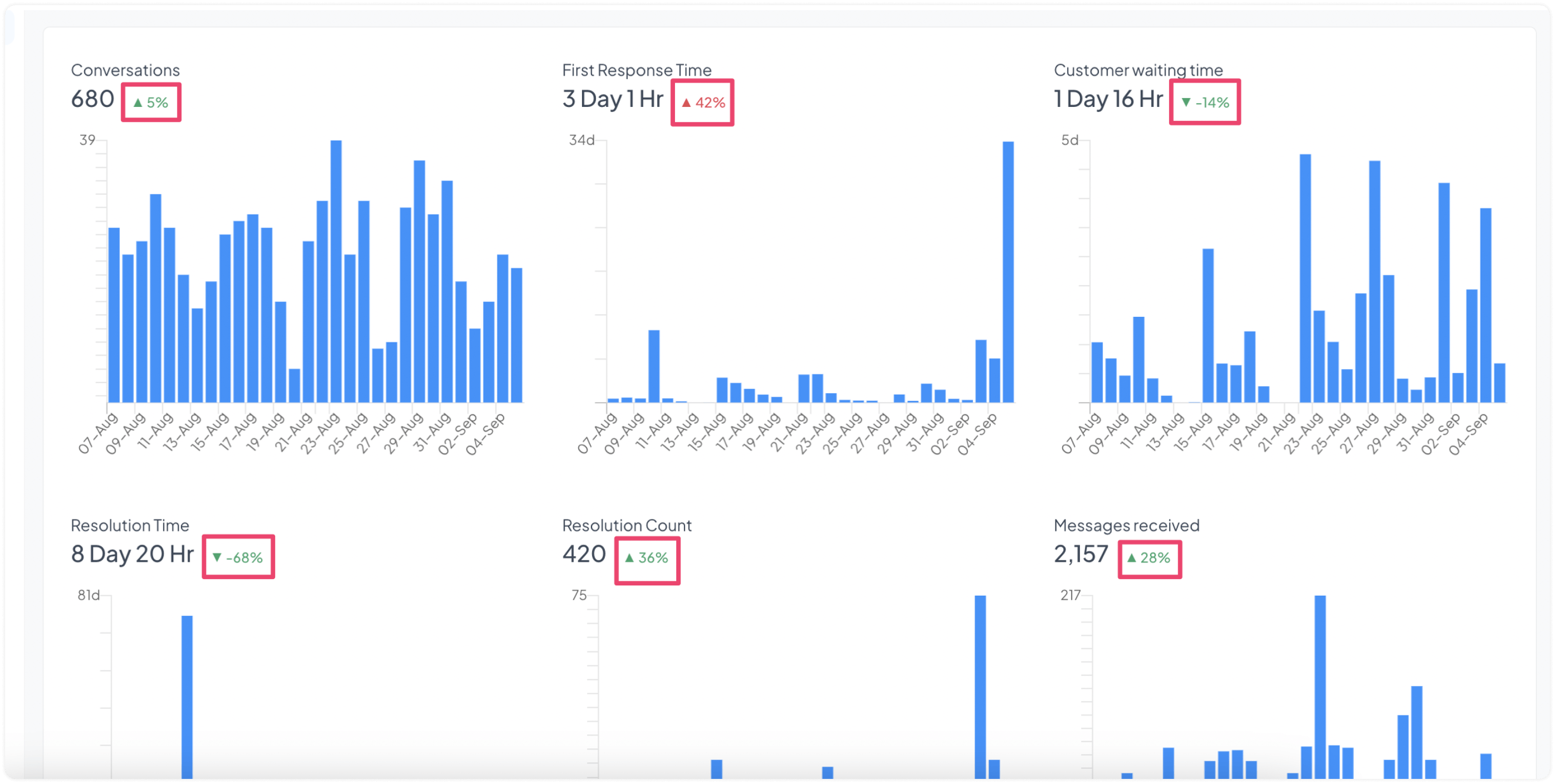
In Chatwoot, your Conversations, Agents, Labels, Inbox, and Team reports can all be interpreted using the same metrics. A typical report looks like the following screenshot, with a graph for each of the metrics.
What each report means and what these metrics are is explained in the following paragraphs.
Types of Reports
Conversations Report
With the Conversations Report, you can learn significant metrics about the health of your conversations, like the volume of messages, First Response Time, Resolution Time, Resolution Count, etc.
Agents Report
With the Agents Report, you can learn significant metrics about your agents, like who handles what volume of messages, what is their First Response Time, Resolution Time, Resolution Count, etc.
Labels Report
Label reports are like Conversations reports but grouped by labels.
Inbox Report
With the Inbox Report, you can learn significant metrics about your inboxes, like which inbox receives how many messages, what is their First Response Time, Resolution Time, Resolution Count, etc.
Team Report
With the Team Report, you can learn significant metrics about your teams, like which one receives how many messages, what is their First Response Time, Resolution Time, Resolution Count, etc.
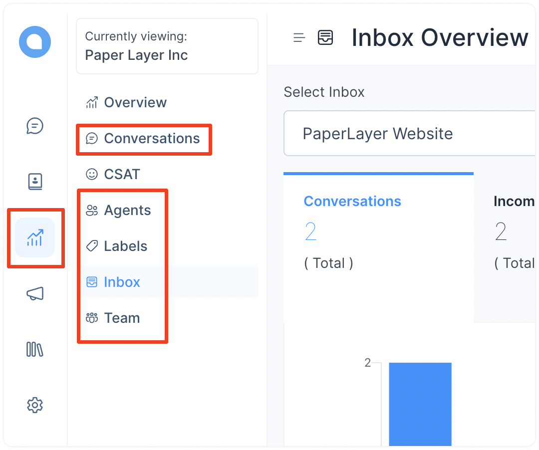
How to open a report?
Look for the “Reports” button on your dashboard's leftmost sidebar. You’ll see the list of available reports when you click on it. Click on any one to view it.
Customizing Reports
All types of reports listed above can be categorized by the same metrics. Each option is explained in the following paragraphs.
Duration
You can select the duration you want to see the report for. By default, this is set for the last 7 days.
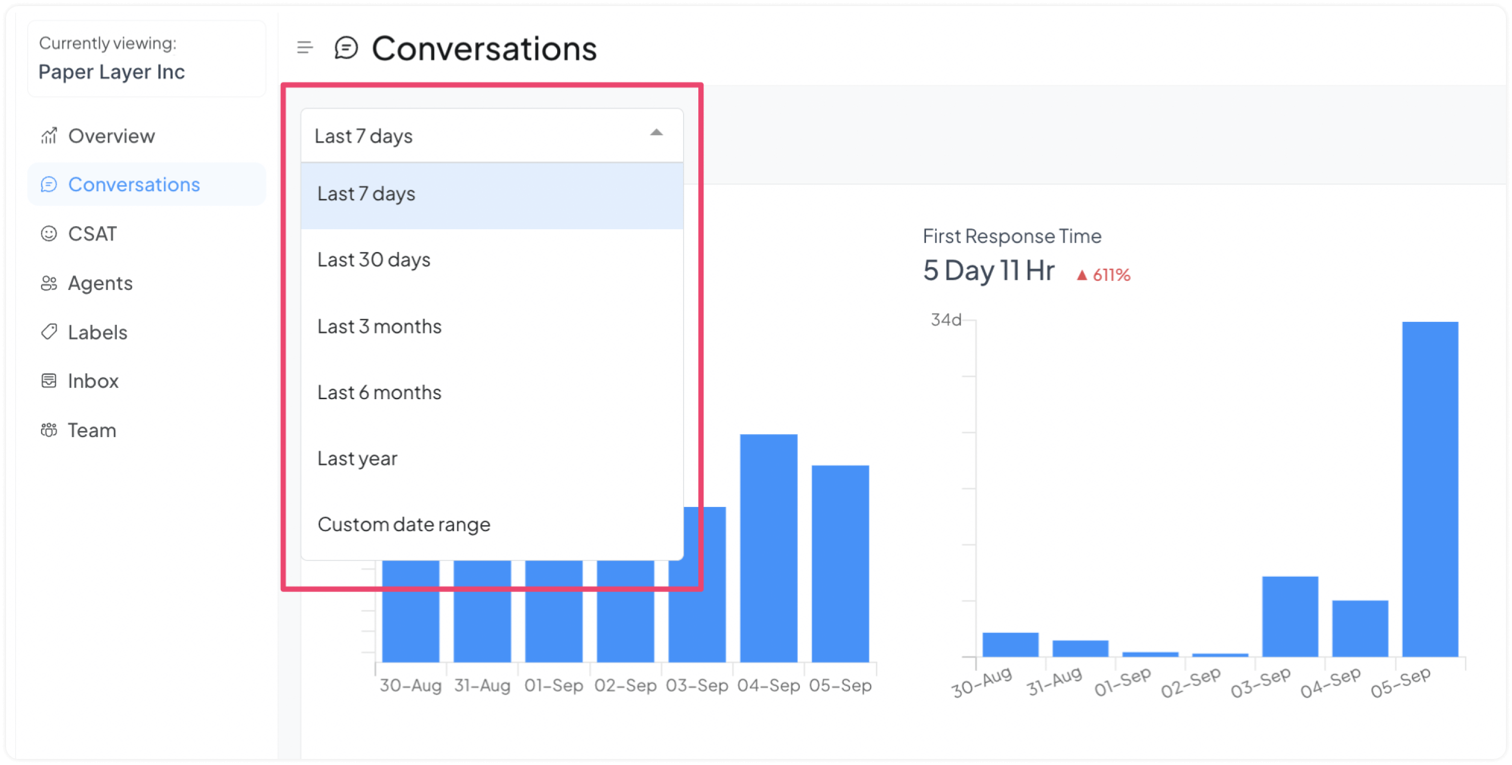
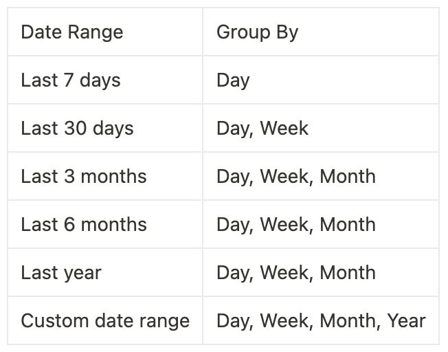
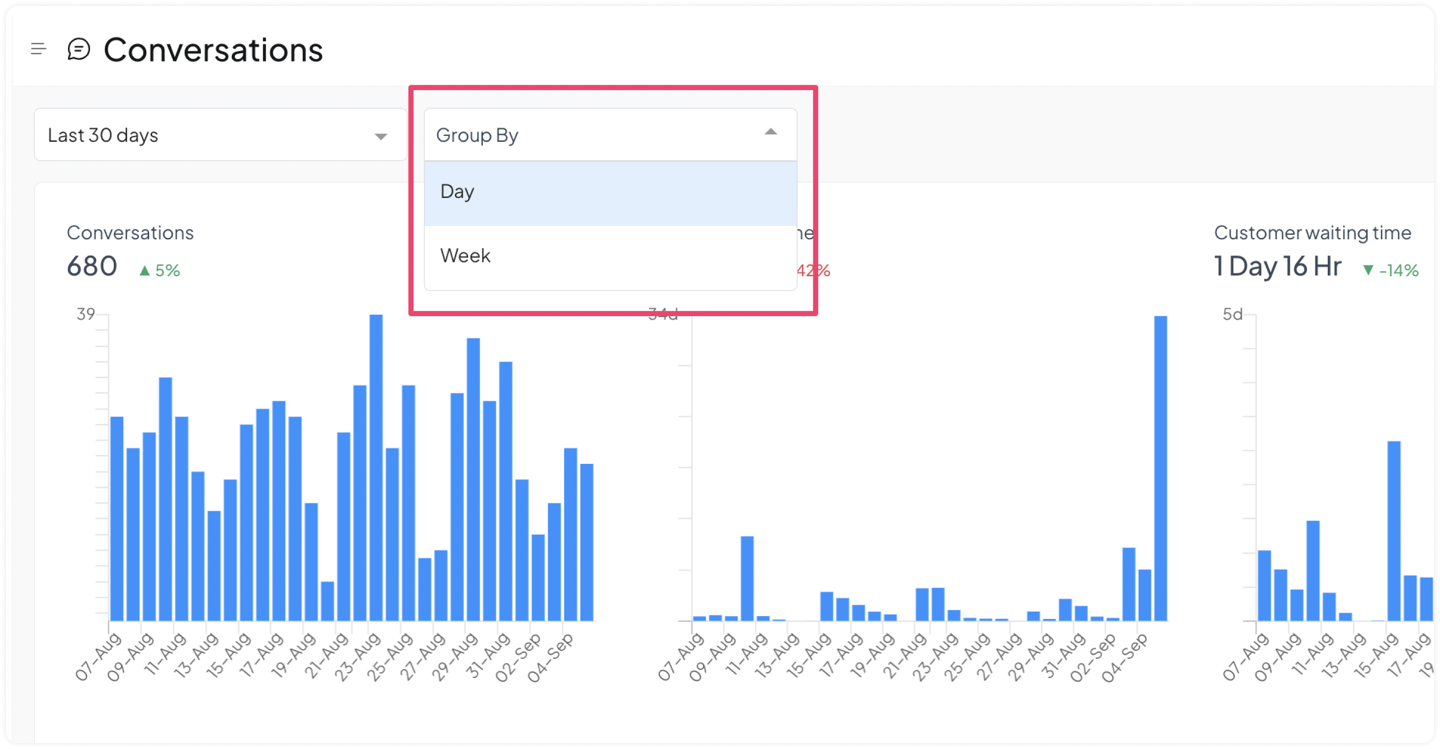
Grouping of data
Once you select the duration, you can select how to group your data. Each date range has a different group by the filter. The date range to group by filter mapping is given in the table below.
Metrics
Every graph shows the trend for the specific metric. Here is what each metric means:
Conversations
This graph shows the total conversations received during the selected period.
If the data has been grouped by day, the graph displayed on this tab will show the total number of conversations received on each day within the selected period.
By hovering the mouse over a specific point on the graph, you can view the exact number of conversations that occurred on that day. In the following example screenshot, you can see that on 25 Aug, 30 conversations occurred.
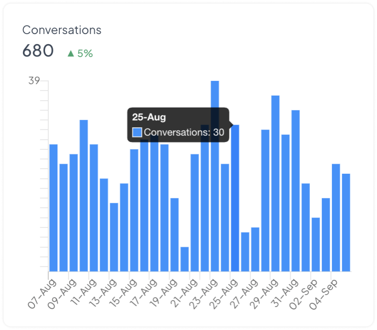
This information can be used to understand the volume of customer interactions and identify patterns or trends in customer behavior.
First Response Time
This graph shows the average time taken to give a first response to a customer conversation.
By hovering the mouse over a specific point on the graph, you can view the exact average time taken for first response and the number of conversations used for the calculation on that day. In the following example screenshot, on 4 Sep, the average First response time was 5 Days & 19 Hours, based on 43 conversations.
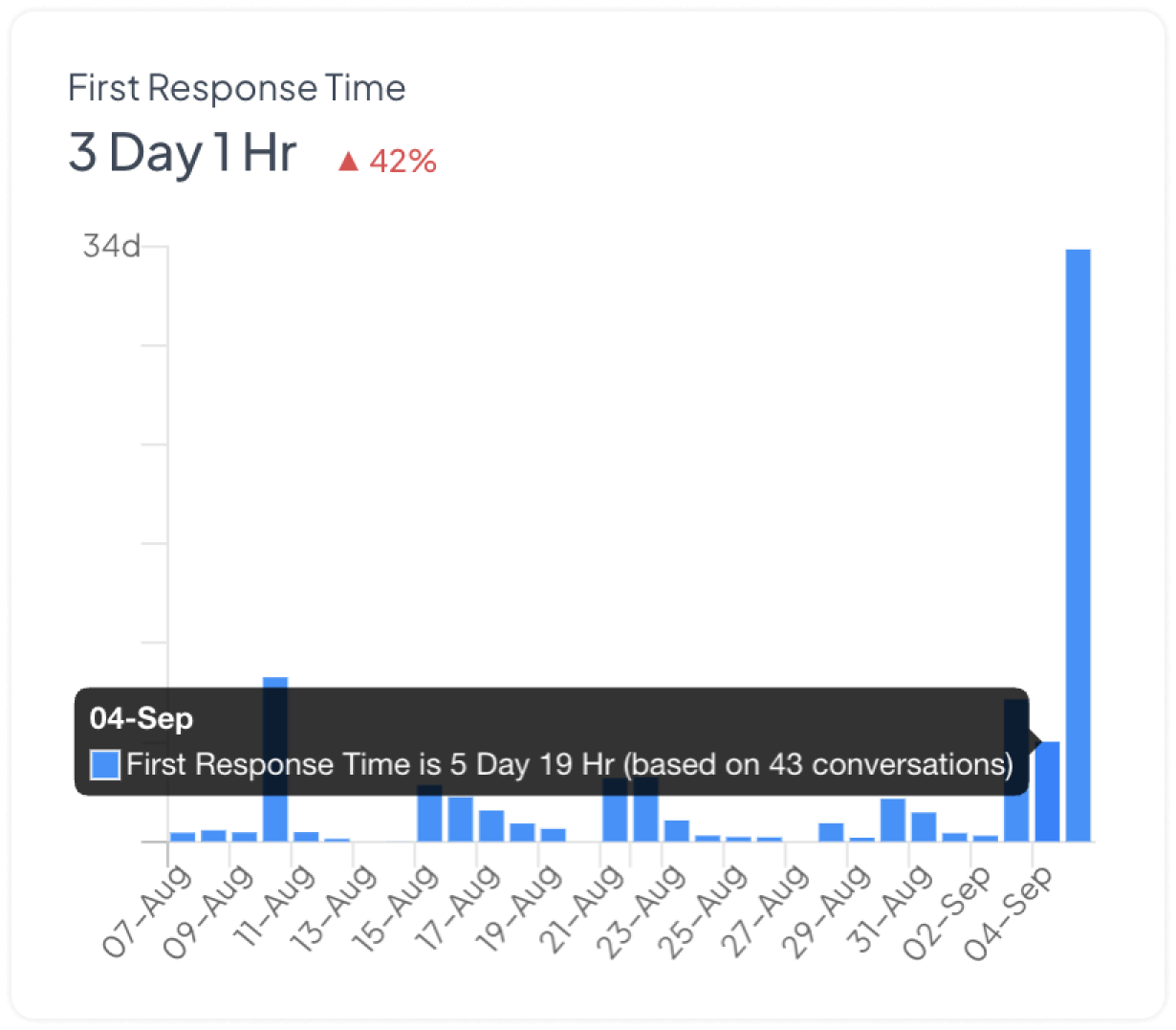
This information can be used to understand the efficiency of the customer service team in responding to customer inquiries and identify areas for improvement.
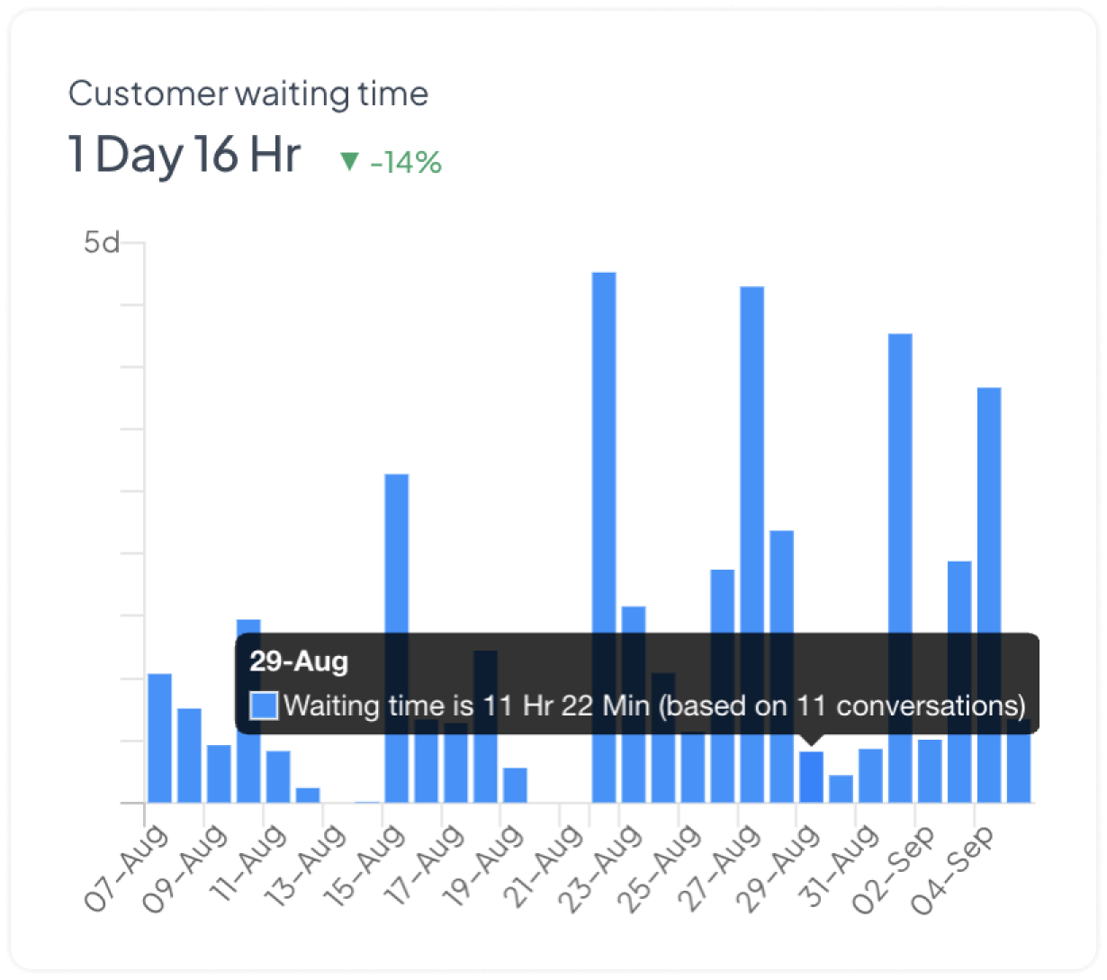
Customer waiting time
This graph shows the duration of time a customer waited for a response from an agent.
If the data has been grouped by day, the graph displayed on this tab will show the total number of conversations received on each day within the selected period.
By hovering the mouse over a specific point on the graph, you can view the average waiting time on that day based on the number of conversations received that day. In the following example screenshot, you can see that on Aug 29, the waiting time was 11 hours & 22 minutes, based on 11 conversations.
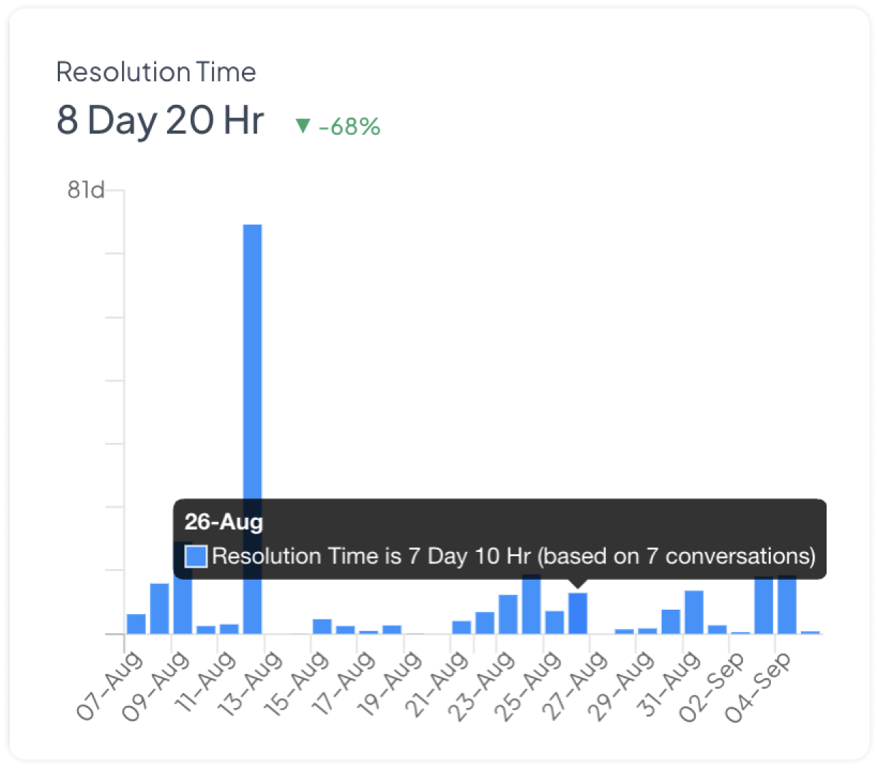
Resolution Time
This graph shows the average time taken to resolve a particular conversation with a customer.
By hovering the mouse over a specific point on the graph, you can view the exact average time taken for resolving conversations and the number of conversations used for the calculation of resolution time on that day. In the following example screenshot, on 26 Aug, average Resolution time was 7 Days & 10 Hours, based on 7 conversations.
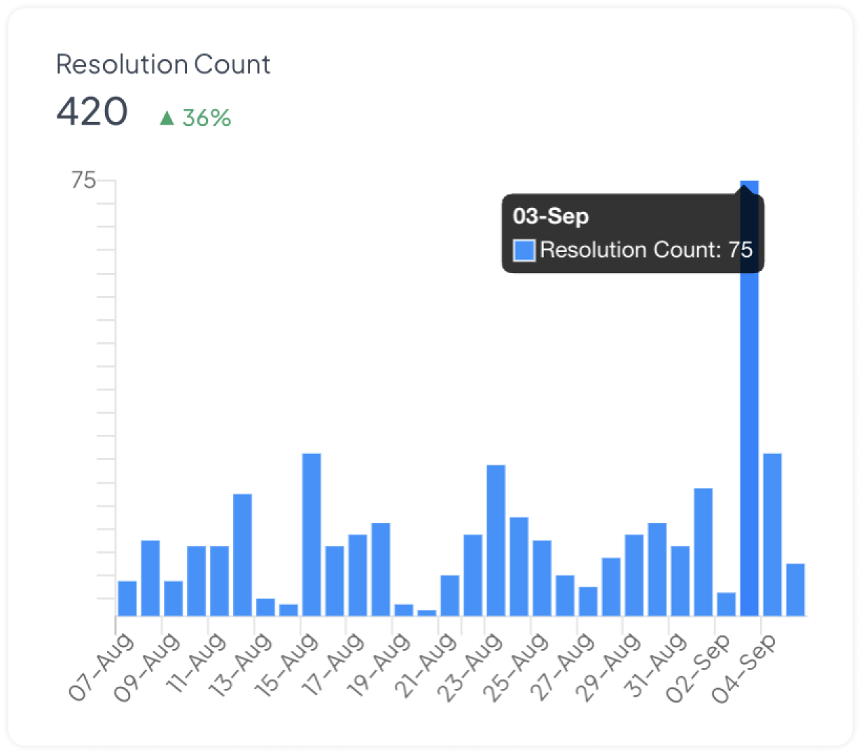
Resolution Count
This graph shows the number of conversations resolved on the selected days.
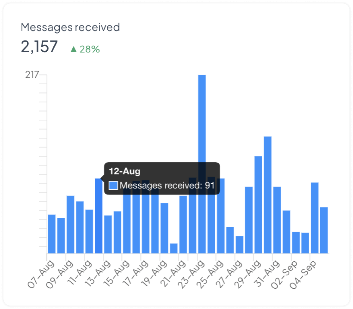
Messages received
This graph shows the number of messages received during the selected period.
By hovering the mouse over a specific point on the graph, you can view the number of incoming messages that occurred on that day. In the following example screenshot, you can see that on 12 Aug, 91 messages were received.
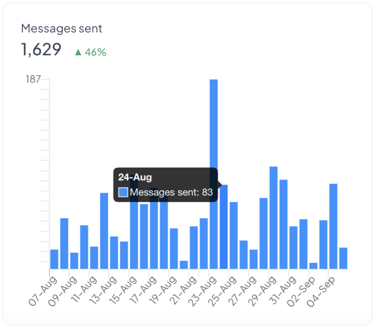
Messages sent
This graph is similar to the Messages received graph, except that it specifically shows the messages that were sent from the account instead of the incoming messages.
Trend
The trend shows the percentage of increase or decrease in the metric data. This is given with every graph. It compares the current time period with the previous time period to provide valuable insights. For example, when analyzing the number of conversations for a specific week, the Trend metric would compare this week's numbers with the numbers from the previous week.
It is displayed on the right side of each metric in the report. The formula used for calculating the trend is given below.
trend = ((current - previous)/previous)*100
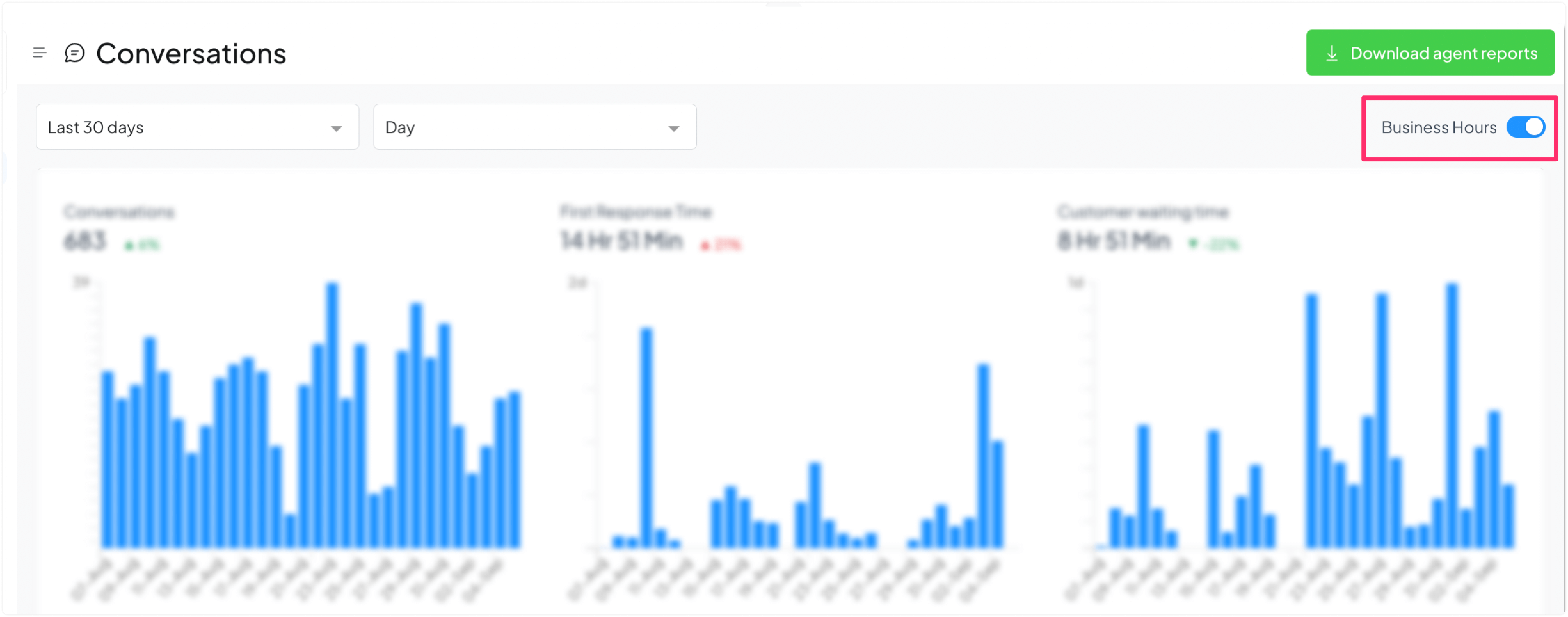
Adjusting reports for Business Hours
Toggle on the switch at the top-right corner of your screen to adjust the report’s metrics for business hours.
Business hours are used to configure the team's availability in each channel. If Business hours are enabled, report data would be calculated based on the business hours. Refer here to set up business hours.